
Example: When I was in high school or college and I had to write a paper, I would spend a good 15 minutes highlighting everything I wrote and changing the typeface a million times, just so I could see what my paper would look like in each style.
I really like "Tahoma"... or maybe "Georgia" looks better... but to be safe, maybe I should just change it back to "Times New Roman"...
Fast forward a few years and I STILL DO THIS on a regular basis. Choosing my default typeface for my e-mail messages in Outlook is like a 2-hour task! :)
If any of you are like me - you know who you are (you're probably the same person that pilfers cool pens at the doctor's office) - you will LOVE the many many FREE typeface options over at DaFont.com.
I am sharing this on the Bustle Blog because you might be undertaking a DIY wedding project that involves words of some sort and you might be looking for a non-standard typeface to use that tells your guests, "Maybe she hired a designer to create this..." A non-Microsoft-Word typeface gives your program/invitation/place cards a more custom look & feel. And they are FREE! It can't get any better than that.
Here are my favorite typefaces from DaFont.com:
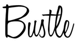
Honey Script (for obvious reasons!)
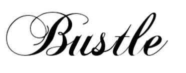
Chopin Script (Sweet & romantic...)
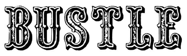
Outlaw (How great at a western/country-themed wedding?!)
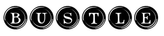
Type Keys (Super-cute if you are using a typewriter or typewriter keys anywhere at your wedding!)
My advice is to head on over to DaFont.com and check out all of the categories of typefaces - you can even type in a word (like I did with "Bustle") or phrase so you can "test" how it will look for whatever project you are working on. Have fun!!
UPDATE: My husband schooled me a little bit on what NOT to use these free fonts for. He said that although you can definitely use them to make one/a few words stand out, they should not be used for lots of text (i.e. a long quote, directions, etc). The reason is because most of the font designers over on DaFont.com are not professional designers and don't give consideration to the spacing between letters and other technical things that only a true preofessional would know how/take the time to do. AND, can you imagine how difficult/annoying it would be to read a paragraph of Type Keys (above)??? :)
Bottom Line: Use these special fonts sparingly to make key words stand out. Stick to standard, professionally-designed fonts for longer phrases/paragraphs. Got it? Good.


2 comments:
Lindsey- I am one of those pen and typeface people. Love a great pen!
Love this post...thanks for the link.
Erika
thanks for sharing! came across this while reading about fonts actually, good advice! ;)
Post a Comment